

Ever spent ages picking the perfect color, only to get the paint home and find it’s not quite the match you envisioned? You hold up that tiny paint chip, or a fabric swatch, and wonder how to get it exactly right on the wall. Matching a specific color – be it from an existing sample or a vision in your head – is definitely more strategic than just picking a card off the shelf. It requires understanding some fundamental color basics and using the right approach, which is exactly what we’ll break down here.
With the Help of a Spectrophotometer.
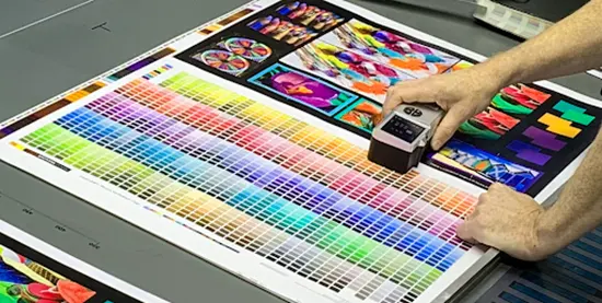
Detection with a spectrophotometer
Why do paint dealers match colors so perfectly? Many times, they employ a spectrophotometer. Consider it as a really intelligent color scanner.
The underlying concept is this: Under the gadget, you lay your sample—perhaps a paint chip or cloth. It precisely counts which colors bounce back and focuses a particular light on the sample. This produces a digital “fingerprint” of the hue. Software then converts this fingerprint into a precise formula, guiding the paint specialist specifically on cyan, magenta, yellow, black, white, or other specified pigment additions to a base paint.
Usually roughly 90% accurate, these devices might be affected by your sample’s roughness or shininess. Experienced paint mixers therefore typically take a few readings and may make minute changes by eye. Bringing a clean, flat sample—at least the size of a quarter—to a paint retailer using this technology is usually your best choice if you want an exact match.
Fine-Tuning with Color Paste.
Sometimes, particularly in industrial or professional environments, colour paste is employed. Paste version of this pigment is super-concentrated. It permits little, exact changes to a batch of paint without too much compromising of its uniformity. Imagine wanting just a little more blue; a small dab of cyan colour paste will do. Usually measured precisely with a digital scale, it is added to a neutral base paint using the spectrophotometer or a recognised recipe.
Test a small batch first.
Whether you got a formula from a machine or you’re mixing by eye, never mix your whole batch of paint at once! Always do a small test batch first.
- Mix Small: Create a small amount (maybe half a cup) using your recipe. Mix it really well.
- Apply & Dry: Paint a small swatch on a test surface that’s similar to your final project (like a piece of scrap drywall or canvas). Let it dry completely. Wet paint often looks different than dry paint (acrylics tend to dry a bit darker, for instance).
- Compare: Look at your dried swatch next to your target color under good, consistent light (natural daylight is often best).
- Adjust (If Needed): Is it too dark? Add a tiny bit more white to your next small test batch. Too blue? Maybe a touch of yellow or orange (its complement) is needed. Keep track of your adjustments!
- Repeat: Keep testing small batches until you nail the color.
This might seem like extra work, but it saves you from wasting gallons of paint or ending up with a color you don’t love. This careful process is key when you want to mix paint colors accurately.
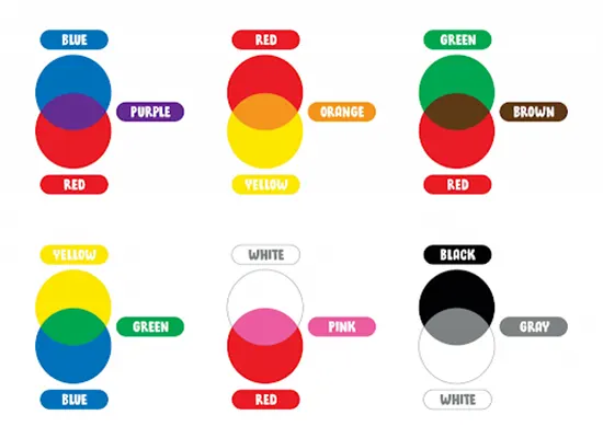
A paint mixing color chart is a fantastic tool, especially for artists or anyone who mixes colors regularly. Think of it as your personal color recipe book. You create it yourself using the specific paints you own.
Typically, it’s a grid. You list your core paint colors along the top and down the side. Then, in each square where a row and column meet, you paint a swatch of the color you get by mixing those two paints. For example, the square where “Cadmium Red” row meets “Ultramarine Blue” column shows the purple mix those two create. Why is this useful?
- Predicts Results: It shows you exactly how your specific tubes of paint interact.
- Saves Time: No more guessing what happens when you mix Phthalo Blue with Cadmium Yellow – just check your chart!
- Ensures Consistency: If you found a perfect green mix last month, your chart helps you recreate it.
- Learning Tool: It visually teaches you about color relationships, warm vs. cool colors, and how different pigments behave (some are stronger mixers than others!).
You can make your chart as simple or detailed as you like. Some people add notes about mixing ratios (like “2 parts yellow, 1 part blue”) or add rows showing tints (color + white) and shades (color + black). Creating a paint mixing color chart is a practical exercise that pays off in the long run.
Example Mixes You Might See on a Chart (Using Common Artist Paints):
- Cadmium Red + Cadmium Yellow: Creates a vibrant Orange.
- Ultramarine Blue + Cadmium Yellow: Makes a standard Green.
- Cadmium Red + Ultramarine Blue: Results in Violet/Purple.
- Cadmium Red + White: Produces Pink.
- Ultramarine Blue + White: Gives Light Blue.
- Burnt Sienna + Ultramarine Blue: Often creates a rich, near-black color (great for natural shadows).
- Cadmium Red + Green (its complement): Tends to make a muted Brown or Gray.
Color mixing example diagram
Remember, the exact results depend on the specific pigments and brands you use. That’s why making your own paint mixing color chart is so valuable.
The color wheel is a good place to start if you want to learn how to blend more colors beyond a simple color chart. A color wheel is a circular diagram that shows colors in relation to each other. Primary, secondary, and tertiary colors are the three categories into which its twelve colors are typically separated. Let’s go over these color wheel words and a few more you should be familiar with:
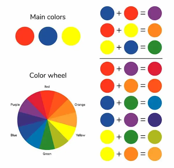
Basic color theory of mixed paints
Red, yellow, and blue are primary colors. On the color wheel, primary colors serve as the foundation for all other colors. A true primary color can never be produced by combining several hues. Each of these three hues represents one point of the triangle formed by their opposite placement on the color wheel.
Orange, green, and violet are examples of secondary colors. Violet is created by combining equal parts of two basic hues, such as red and blue. Additionally, these three hues form a triangle with their opposites.
Red-orange, yellow-orange, yellow-green, blue-green, blue-violet, and red-violet are tertiary hues. Tertiary colors, also referred to as intermediate colors, are created by combining equal amounts of a primary color with the adjacent secondary color on the color wheel. The leftover spaces between primary and secondary colors are filled by these hues.
Yellow and violet are examples of complementary colors, which are two hues that are precisely opposite one another on the color wheel. When paired together, these hues create a striking contrast. When combined, they also neutralize one another, creating a gray, brown, or black color.
Analogous colors are groups of three colors that sit next to each other on the color wheel and have the closest relationships. The colors red, violet, and red-violet are an example of an analogous color group. Together, these hues provide a pleasing effect.
- Hue: According to color theory, a hue is an unadulterated color devoid of any tint or shade.
- Shade: A shade is a color that has been darkened by the addition of black.
- Tint: A tint is a color that has been lightened by the addition of white.
- Tone: A color’s overall darkness or lightness is referred to as its tone. An endless number of tones can be found in a single color.
Using a color wheel is a quick and simple approach to determine which paint colors will likely mix well together, stand out next to one another, darken or brighten one another, and more.