You know that feeling, right? You buy paint, confident you’ve got the shade. You start working, but when you need to mix more, or try to touch up later… the color is wrong. It’s a subtle difference, but it screams “oops!” and makes you want to start all over. (And seriously, who wants to waste perfectly good paint?) Or maybe your art projects feel limited because getting acrylics to blend feels impossible, or trying to use a spray gun results in drips and clogs because the mix isn’t right. For the professionals, paint mixing sometimes appears like a difficulty; for the rest of us, it leaves us hopeless.
But what if you could figure it out?? If you could really attain that ideal color match, flawless blend, or seamless spray finish? It absolutely is! Think of this as your straightforward guide to mastering paint mixing. We’re here to simplify things and share the practical knowledge that makes a real difference. We’ll walk you through the steps for accurately mixing paint colors to hit that target shade, whether for home or hobby. We’ll cover the best ways to mix acrylic paint for beautiful transitions and show you exactly how to get paint ready for flawless application through a spray gun. We’ll even look at how a paint mixing color chart can serve as your essential roadmap. Stop guessing and start mixing with confidence!
How Do You Mix Paint Colors to Get the Target Color?
Ever spent ages picking the perfect color, only to get the paint home and find it’s not quite the match you envisioned? You hold up that tiny paint chip, or a fabric swatch, and wonder how to get it exactly right on the wall. Matching a specific color – be it from an existing sample or a vision in your head – is definitely more strategic than just picking a card off the shelf. It requires understanding some fundamental color basics and using the right approach, which is exactly what we’ll break down here.
With the Help of a Spectrophotometer.

Detection with a spectrophotometer
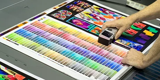
Why do paint dealers match colors so perfectly? Many times, they employ a spectrophotometer. Consider it as a really intelligent color scanner.
The underlying concept is this: Under the gadget, you lay your sample—perhaps a paint chip or cloth. It precisely counts which colors bounce back and focuses a particular light on the sample. This produces a digital “fingerprint” of the hue. Software then converts this fingerprint into a precise formula, guiding the paint specialist specifically on cyan, magenta, yellow, black, white, or other specified pigment additions to a base paint.
Usually roughly 90% accurate, these devices might be affected by your sample’s roughness or shininess. Experienced paint mixers therefore typically take a few readings and may make minute changes by eye. Bringing a clean, flat sample—at least the size of a quarter—to a paint retailer using this technology is usually your best choice if you want an exact match.
Fine-Tuning with Color Paste.
Sometimes, particularly in industrial or professional environments, colour paste is employed. Paste version of this pigment is super-concentrated. It permits little, exact changes to a batch of paint without too much compromising of its uniformity. Imagine wanting just a little more blue; a small dab of cyan colour paste will do. Usually measured precisely with a digital scale, it is added to a neutral base paint using the spectrophotometer or a recognised recipe.
Test a small batch first.
Whether you got a formula from a machine or you’re mixing by eye, never mix your whole batch of paint at once! Always do a small test batch first.
- Mix Small: Create a small amount (maybe half a cup) using your recipe. Mix it really well.
- Apply & Dry: Paint a small swatch on a test surface that’s similar to your final project (like a piece of scrap drywall or canvas). Let it dry completely. Wet paint often looks different than dry paint (acrylics tend to dry a bit darker, for instance).
- Compare: Look at your dried swatch next to your target color under good, consistent light (natural daylight is often best).
- Adjust (If Needed): Is it too dark? Add a tiny bit more white to your next small test batch. Too blue? Maybe a touch of yellow or orange (its complement) is needed. Keep track of your adjustments!
- Repeat: Keep testing small batches until you nail the color.
This might seem like extra work, but it saves you from wasting gallons of paint or ending up with a color you don’t love. This careful process is key when you want to mix paint colors accurately.
Five Basic Colors.
Forget the simple red, yellow, and blue you learned in school for a moment. For accurate paint mixing, professionals often think in terms of cyan, magenta, yellow, black, and white (sometimes called CMYK + White).
- Cyan: A specific blue, kind of like a bright turquoise. It’s key for creating greens and vibrant blues.
- Magenta: A vivid reddish-purple. You need this for clean purples, pinks, and some reds.
- Yellow: The bright primary we all know. Essential for greens, oranges, and warming up colors.
- Black: Used carefully to darken colors or create shades. Too much can make colors look muddy. Sometimes, mixing cyan, magenta, and yellow makes a richer dark tone than pure black.
- White: The key to lightening colors and creating tints or pastels. Titanium White is a common, strong choice.
Using these five as your base allows for a wider, more vibrant range of colors than the traditional RYB model. Think of them as the core ingredients in your color kitchen.
The Color Chart Is the Secret for Accurate Color.
A paint mixing color chart is a fantastic tool, especially for artists or anyone who mixes colors regularly. Think of it as your personal color recipe book. You create it yourself using the specific paints you own.
Typically, it’s a grid. You list your core paint colors along the top and down the side. Then, in each square where a row and column meet, you paint a swatch of the color you get by mixing those two paints. For example, the square where “Cadmium Red” row meets “Ultramarine Blue” column shows the purple mix those two create. Why is this useful?
- Predicts Results: It shows you exactly how your specific tubes of paint interact.
- Saves Time: No more guessing what happens when you mix Phthalo Blue with Cadmium Yellow – just check your chart!
- Ensures Consistency: If you found a perfect green mix last month, your chart helps you recreate it.
- Learning Tool: It visually teaches you about color relationships, warm vs. cool colors, and how different pigments behave (some are stronger mixers than others!).
You can make your chart as simple or detailed as you like. Some people add notes about mixing ratios (like “2 parts yellow, 1 part blue”) or add rows showing tints (color + white) and shades (color + black). Creating a paint mixing color chart is a practical exercise that pays off in the long run.
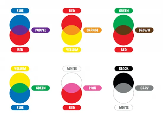
Example Mixes You Might See on a Chart (Using Common Artist Paints):
- Cadmium Red + Cadmium Yellow: Creates a vibrant Orange.
- Ultramarine Blue + Cadmium Yellow: Makes a standard Green.
- Cadmium Red + Ultramarine Blue: Results in Violet/Purple.
- Cadmium Red + White: Produces Pink.
- Ultramarine Blue + White: Gives Light Blue.
- Burnt Sienna + Ultramarine Blue: Often creates a rich, near-black color (great for natural shadows).
- Cadmium Red + Green (its complement): Tends to make a muted Brown or Gray.

Color mixing example diagram
Remember, the exact results depend on the specific pigments and brands you use. That’s why making your own paint mixing color chart is so valuable.
Basic Color Theory.
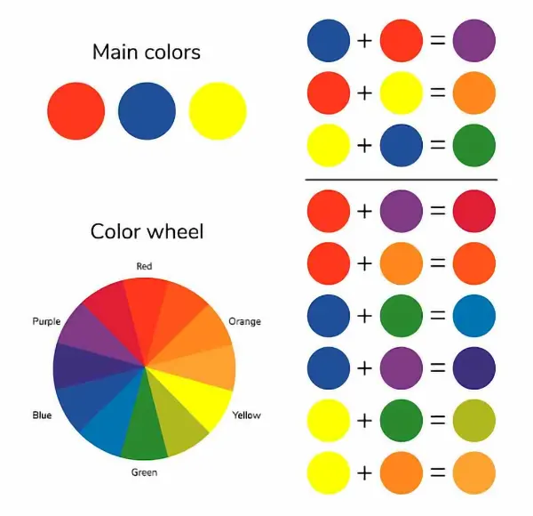
The color wheel is a good place to start if you want to learn how to blend more colors beyond a simple color chart. A color wheel is a circular diagram that shows colors in relation to each other. Primary, secondary, and tertiary colors are the three categories into which its twelve colors are typically separated. Let’s go over these color wheel words and a few more you should be familiar with:

Basic color theory of mixed paints
Red, yellow, and blue are primary colors. On the color wheel, primary colors serve as the foundation for all other colors. A true primary color can never be produced by combining several hues. Each of these three hues represents one point of the triangle formed by their opposite placement on the color wheel.
Orange, green, and violet are examples of secondary colors. Violet is created by combining equal parts of two basic hues, such as red and blue. Additionally, these three hues form a triangle with their opposites.
Red-orange, yellow-orange, yellow-green, blue-green, blue-violet, and red-violet are tertiary hues. Tertiary colors, also referred to as intermediate colors, are created by combining equal amounts of a primary color with the adjacent secondary color on the color wheel. The leftover spaces between primary and secondary colors are filled by these hues.
Yellow and violet are examples of complementary colors, which are two hues that are precisely opposite one another on the color wheel. When paired together, these hues create a striking contrast. When combined, they also neutralize one another, creating a gray, brown, or black color.
Analogous colors are groups of three colors that sit next to each other on the color wheel and have the closest relationships. The colors red, violet, and red-violet are an example of an analogous color group. Together, these hues provide a pleasing effect.
- Hue: According to color theory, a hue is an unadulterated color devoid of any tint or shade.
- Shade: A shade is a color that has been darkened by the addition of black.
- Tint: A tint is a color that has been lightened by the addition of white.
- Tone: A color’s overall darkness or lightness is referred to as its tone. An endless number of tones can be found in a single color.
Using a color wheel is a quick and simple approach to determine which paint colors will likely mix well together, stand out next to one another, darken or brighten one another, and more.
How to Mix Acrylic Paint?
Despite the fact that acrylic paint is a popular choice due to its adaptability and vivid hues, the fact that it dries so quickly may be challenging, particularly when it comes to blending and combining colours. Let’s go over the fundamentals of how to efficiently mix acrylic paint, and then we’ll look at other approaches to get smooth blends.
Mixing acrylics isn’t just about inventing the perfect shade—it’s a race against the clock. You’ve got to get your colors right and keep them consistent before they start drying up on your palette. One moment it’s creamy and smooth, the next it’s stubborn and unworkable. Timing, here, is everything.
- Start with Good Paint: Artist-grade paints (like Liquitex or Golden) have more pigment and fewer fillers than student grades. This means cleaner, brighter mixes.
- Use a Palette Knife: Mix colors with a palette knife, not your brush. It’s easier to clean, prevents muddying your brush, and mixes more thoroughly on a flat palette (plastic or disposable paper palettes work well).
- Dark Into Light: Always add the darker color to the lighter color in small amounts. It takes only a tiny bit of blue to change white, but a lot of white to lighten blue. This saves paint!
- Avoid Black (Mostly): Straight black can make colors look dull or muddy when darkening them. Try using dark browns (like Raw Umber), deep blues (like Ultramarine or Prussian Blue), or even the color’s complement (the color opposite it on the color wheel) for richer shadows.
- White is Your Friend: Adding a touch of Titanium White not only lightens but can also increase opacity and give colors more substance. You’ll use a lot of white, so buy a bigger tube!
- Make Color Charts: As mentioned, creating a chart specifically for your acrylics helps you learn how your colors interact.
- Premix or Free Mix?: You can premix all your colors before starting (good for planned paintings) or mix as you go (more spontaneous). If free mixing, work fast or use aids to slow drying.
- Save Your Mixes: If you create a perfect color, store leftovers in small airtight containers (like old film canisters or purpose-made paint pots). Acrylics dry fast when exposed to air!
Once you get the hang of mixing acrylics, it’s like unlocking a secret color vault—suddenly, the possibilities for your art explode. No more settling for what’s straight out of the tube—you’re in full control of mood, depth, and harmony.
So, paint mixing – it doesn’t have to be that mysterious art form or frustrating chore anymore, right? Whether you’re aiming to nail that perfect color match for a touch-up (we’ve all been there!), wanting to blend acrylics smoothly for your next artwork without creating mud, or getting your paint consistency just right for that flawless spray gun finish, you’ve now got the keys.
You understand the magic behind starting with that CMYK+White foundation for true color creation. You know how game-changing tools like spectrophotometers or even a simple paint mixing color chart can be. You’ve seen how mediums give you control over those sometimes-finicky acrylics, and crucially, why safety, straining, and patient, gradual thinning are non-negotiables for spray painting. Armed with these principles and a bit of practice, you really can ditch the guesswork. You’re on your way to achieving those consistent, beautiful results you’ve been aiming for across all your projects.
And hey, if you’re looking for the right paint suppliers, specific mixing mediums, or even local professionals to help with a bigger project, don’t forget to check out coatingsdirectory.com. It’s a fantastic resource to connect you with exactly what you need.
Now, I’d love to hear from you! What’s your biggest paint mixing challenge? Or maybe you have a genius tip you’d like to share? Drop a comment below!
FAQs
What are the basic colors needed to mix most paint colors?
You mainly need cyan, magenta, yellow, black, and white for the widest range. While traditional red, yellow, and blue work, using pure cyan, magenta, yellow (CMY), plus black (K) and white provides a more accurate and vibrant spectrum for creating nearly any hue, tint, or shade in paint mixing.
How can I make acrylic paint dry slower for blending?
Add an acrylic retarder or slow-dry blending medium to your paint. These additives extend the ‘open time’ of acrylics, allowing more time for techniques like wet-on-wet blending. Alternatively, using paints specifically designed for slow drying, like Golden Open Acrylics, can also achieve this.
Can I mix different brands of acrylic paint together?
Yes, you generally can mix different brands of acrylic paint. Most acrylic paints are compatible. However, mixing artist-grade (higher pigment) with student-grade (more filler) might slightly reduce the vibrancy or alter the consistency compared to using only artist-grade paints. Always test mixes first.

